Redesigned website to reflect the modern and welcoming energy of the church
This project focused on redesigning an existing church website that had become visually outdated and difficult to navigate. While the team was managing their site independently using a no-code platform, the design lacked responsiveness across devices and suffered from inconsistent typography, visual hierarchy, and overall direction.
The goal of the redesign was to modernize the website while preserving ease of self-management. Key objectives included establishing a cohesive visual identity, improving navigation and content hierarchy, and prioritizing features that reflected the church’s welcoming culture—such as prominently highlighting events, activities, and community engagement.
The final solution delivered a streamlined, responsive website built on a modern no-code platform, empowering the church to confidently manage their content while presenting a clear, inviting, and relevant online presence.
Goals + features
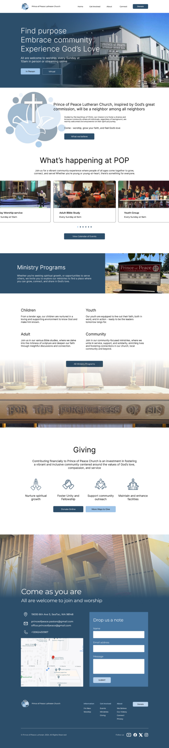
User focused layout
Improved navigation and mobile responsive layout. Updated information hierarchy to make finding information simple and easy.
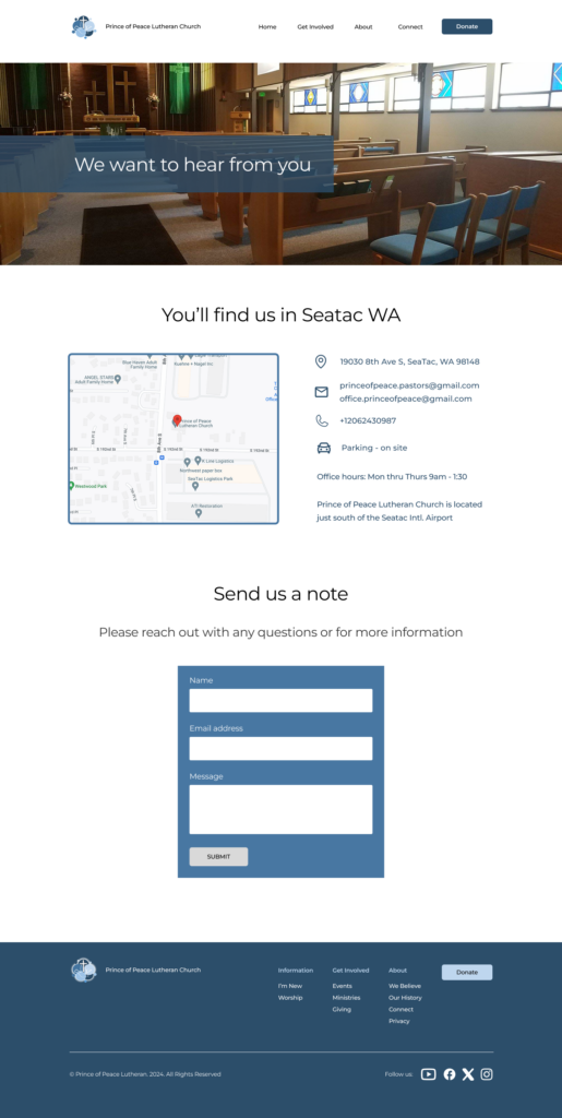
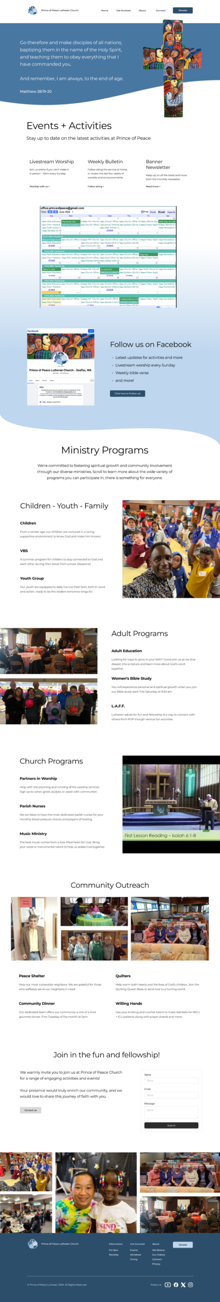
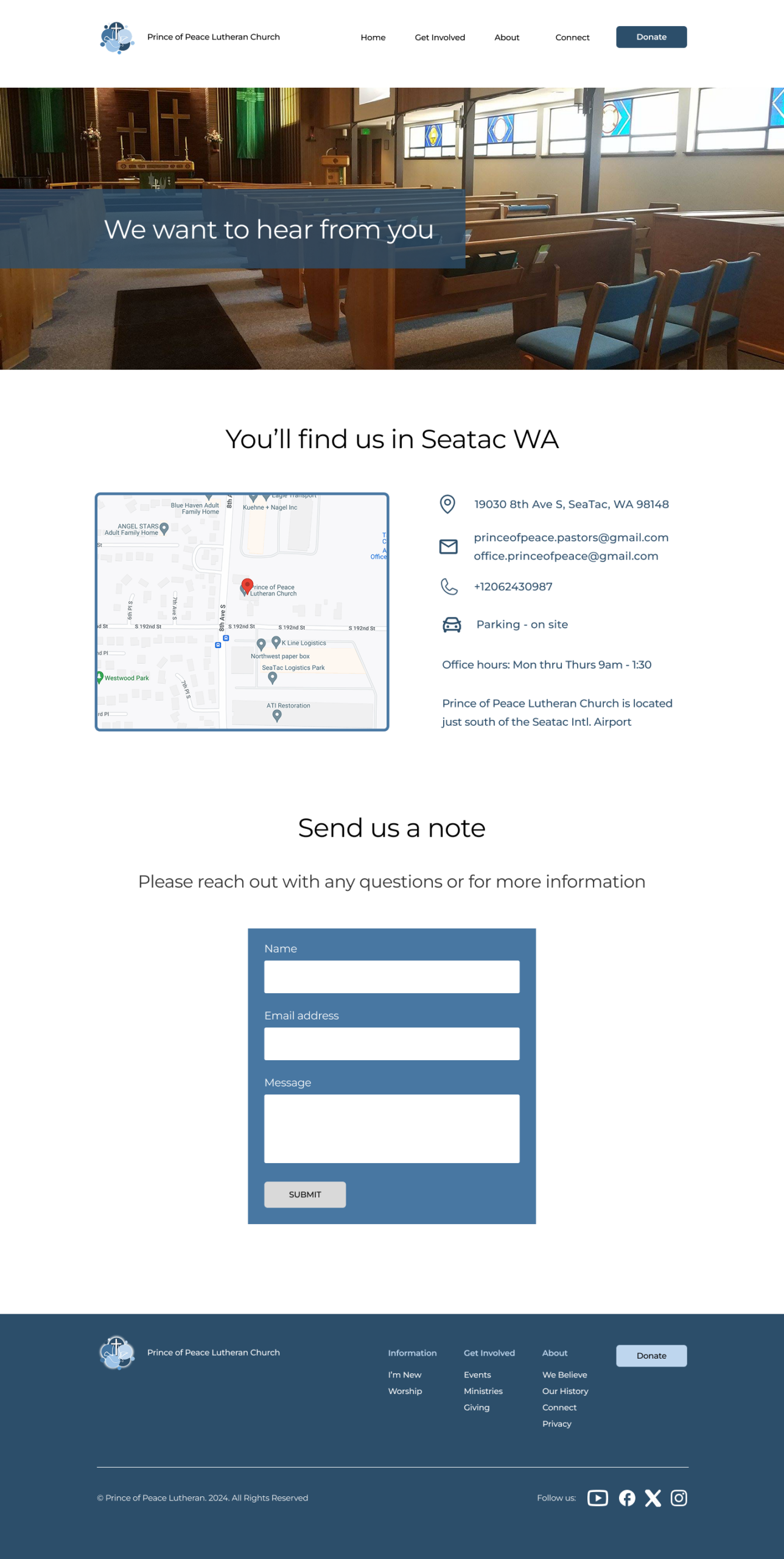
Information hub
Information about ministry programs, activities, and events. Easily find worship service videos, weekly bulletin, and the monthly newsletter.
Self Management
They needed a website platform that allowed for easy ongoing updates for new events, current bulletins/newsletters, and videos.
Design + Development Process
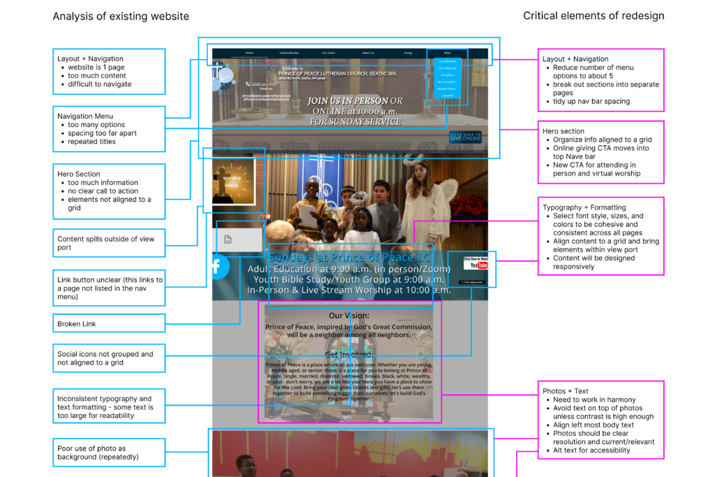
Website Audit & Discovery
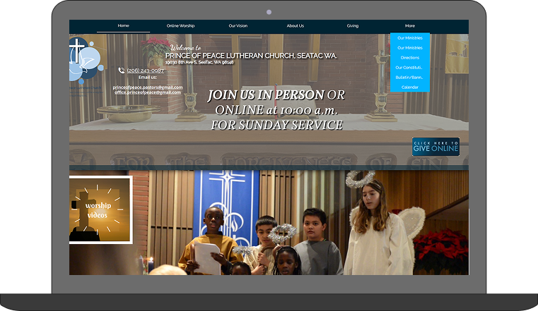
I began by conducting a detailed analysis of the existing website, reviewing layout structure, navigation flow, content density, and visual consistency. This audit revealed several key challenges:
A long, single-page layout with excessive content and little hierarchy
Inconsistent typography and formatting across sections
No defined visual system for color, fonts, or branding
Limited responsiveness across different screen sizes
This discovery phase helped clarify both what wasn’t working and what needed to be preserved.
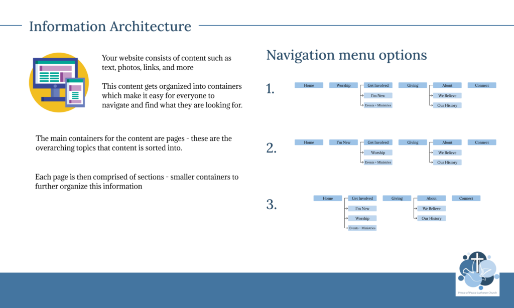
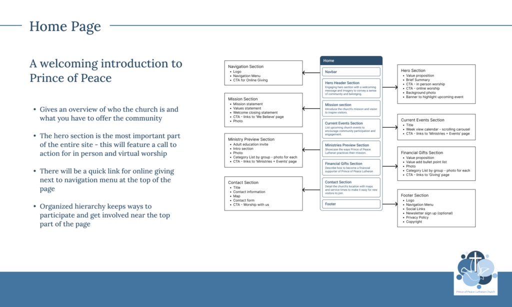
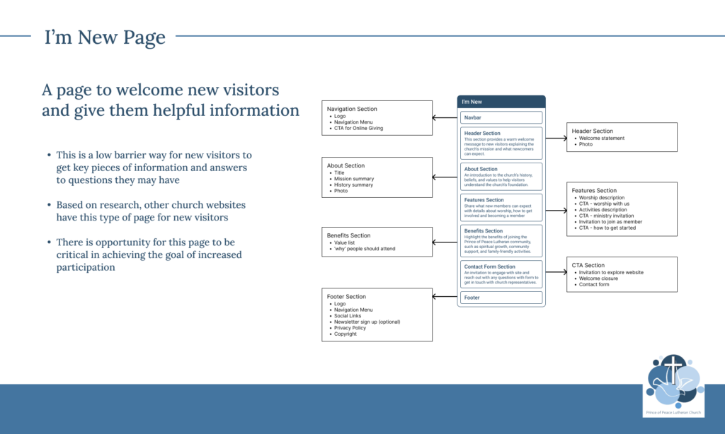
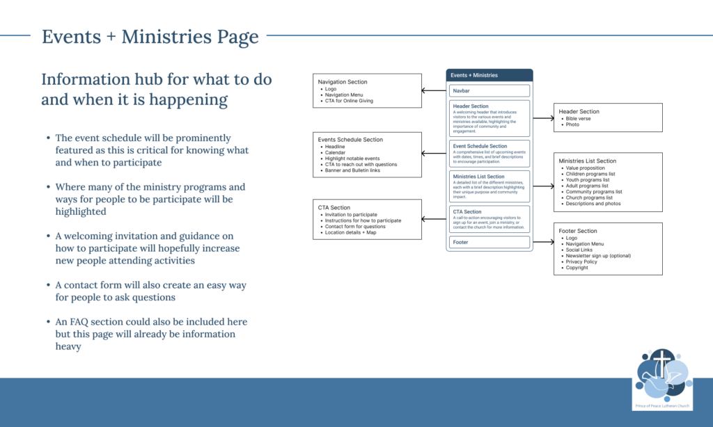
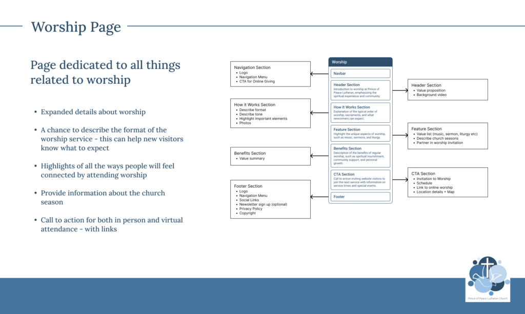
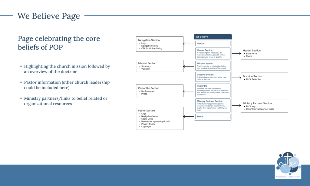
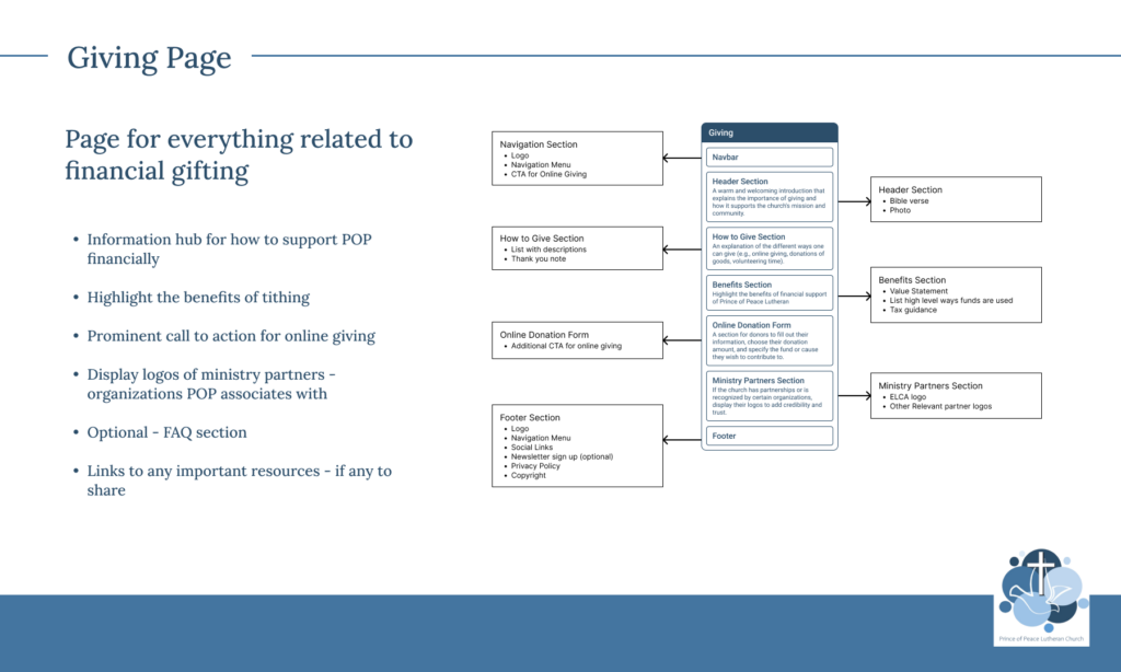
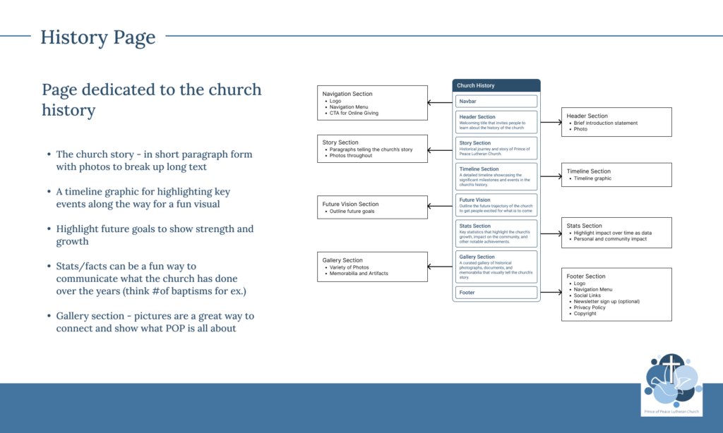
Information Architecture
To address the content-heavy experience, I restructured the site’s information architecture. I explored multiple page structures before refining the navigation down to essential pages only. The result was:
A simplified page hierarchy
Intuitive navigation designed to reduce cognitive load
Clear pathways for users to quickly find key information
This step ensured the website felt approachable rather than overwhelming.
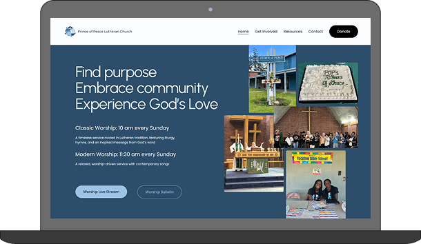
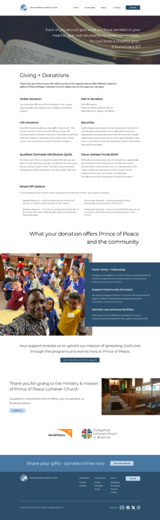
Visual Mockups
With the structure in place, I outlined each proposed page using wireframes that included body copy and photo placeholders. These were followed by full-color, high-fidelity mockups to:
Communicate layout, spacing, and content flow
Showcase the new visual system in context
Align stakeholders and gather design approval before development
This phase helped translate strategy into a tangible, shared vision.
Implementation
After evaluating several no-code website platforms, I selected Squarespace as the ideal solution. It provided:
Modern, responsive design tools
Flexibility to support the approved visual direction
An intuitive editing experience that allowed the church to continue managing their website independently
The platform choice balanced design quality with long-term usability.
Before + After
Results
An easy to use website they are proud to share
Before the redesign, the website was something they hesitated to share. Today, it’s a resource they’re proud of; one that clearly communicates who they are, highlights their activities, and reflects the welcoming, modern energy of their community.
Your next online upgrade starts here
Send over your goals and pain points, and together we’ll create a website and digital presence that drives real results.